Rebranding for Launch:
Inspired by the bustling streets of L.A.
My Role
Visual Brand Identity + Collateral Design
Special Thanks
Jose Hernandez and Megan Barker
The Context: What’s Launch?
Launch is an LA-based outpatient center that helps young adults in recovery from addiction.
After getting sober, many young adults find themselves paralyzed by the fear of handling responsibilities: finishing school, getting a job, and paying the bills. Without the right resources, they can easily get trapped in a vicious cycle of relapse and failure.
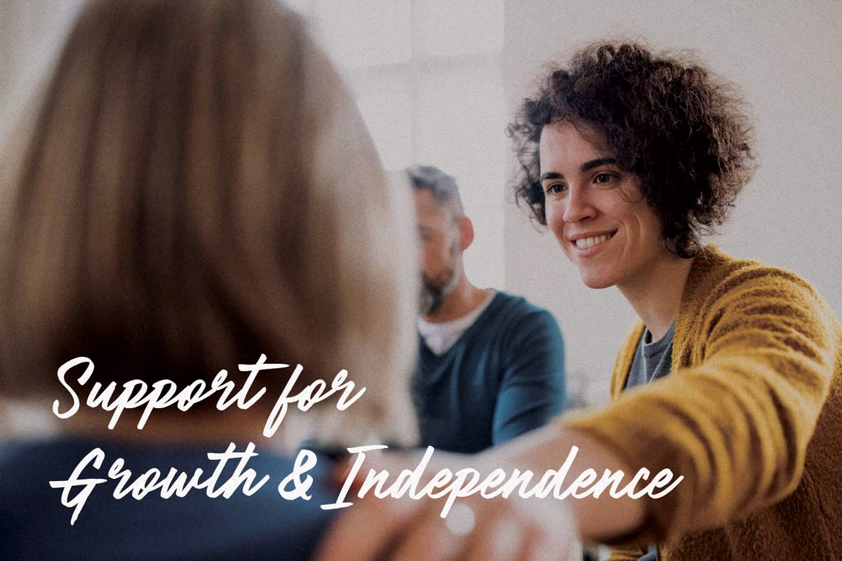
Launch combines therapy, family guidance, and academic and career support to help clients get unstuck.
The Mission: What Does Launch Need?
Launch was unhappy with their branding. They wanted me to overhaul their logo and visual identity.
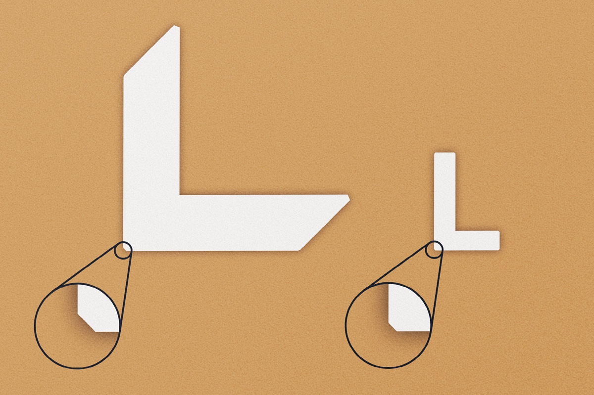
Their old logo used a rocket to symbolize the client’s journey upward. When I aked them what they didn’t like about it, they told me, “The rocket looks like it’s crashing. That does not bode well.” It had also been referred to as childish.
The Old Logo
My goal in redesigning the brand was to honor their legacy while introducing a more bold & iconic look to carry them forward.
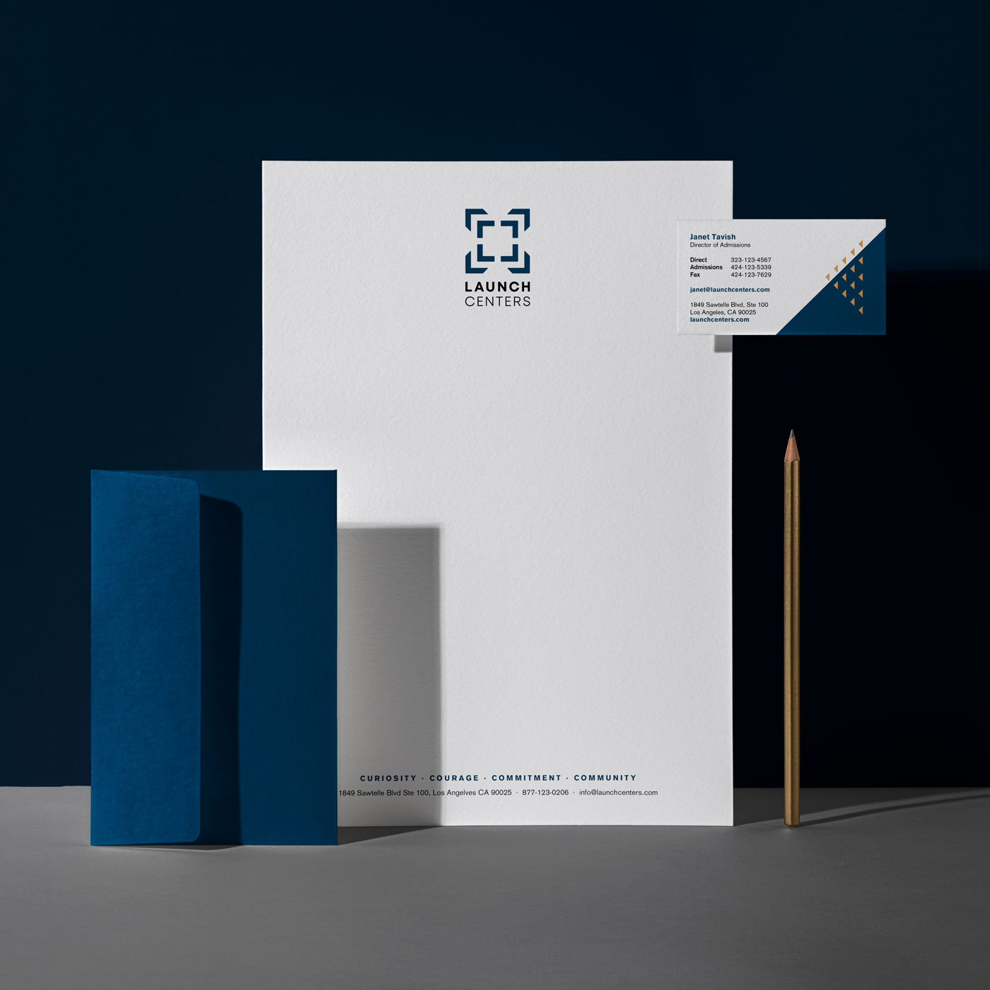
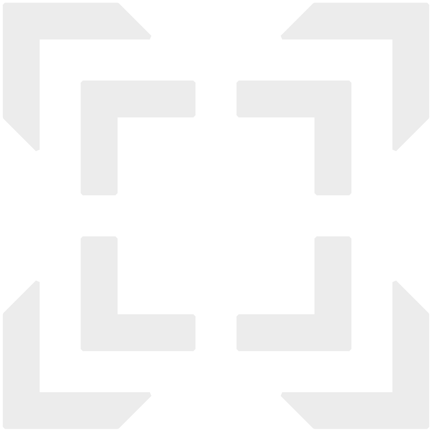
The New Logo
The new logo had to resonate with an early-20s audience—and their parents—while also appealing to referring professionals.
I worked with simple, sturdy geometric shapes to create a new symbol that feels bold, trusted, and timeless.
For the wordmark, I chose a fresh geometric sans serif, giving it a sharp look and a clean, contemporary feel that ties in the old design with the new.
The Process: Here’s How We Did It
Before starting the project, I interviewed Launch’s founder, Jose Hernandez.
We dove deep into the company’s mission, and what makes Launch unique.
“We’re in the middle of one of the world’s most vivacious cities. We have every job imaginable at the tip of our fingers. We want to empower people to pursue their passion whether it be business, medicine, art—whatever.”
JOSE HERNANDEZ
To capture that sentiment, I pulled visual inspiration from aerial views of Los Angeles—especially the painted lines on its bustling streets.
I sketched out many different ideas exploring how to achieve that sense of direction and motion.
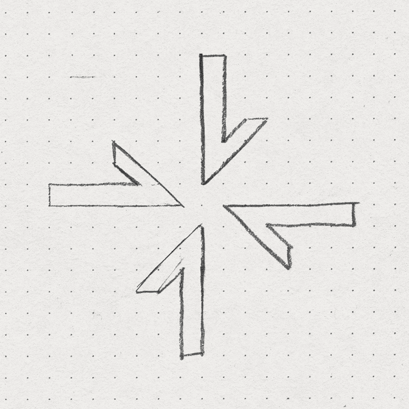
I eventually landed on the “launch pad”—a design that pays homage to their previous logo, the rocket.
Launch is the place where young adults are given the opportunity to find a purpose. It’s where they gain the structure, tools, education, and support they need to lead their lives with meaning.
It’s the launch pad that empowers them to successfully take off.
The Visual Identity: Brand Type
Text and Headlines
Akzidenz Grotesk brings an expert look with timeless style, showcasing Launch’s authority, trustworthiness, and innovative approach to care.
Slogans and Subheaders
The warm script Anything Goes aligns with Launch’s dedication to providing compassionate support and personalized services to each of its clients.
Logotype
I designed the launch pad with a bevel on the corners to give it a sharp, focused feel that hearkens to Launch’s excellence. I modified the font Mont to give it those same corners, unifying it with the symbol to create a truly ownable logo.
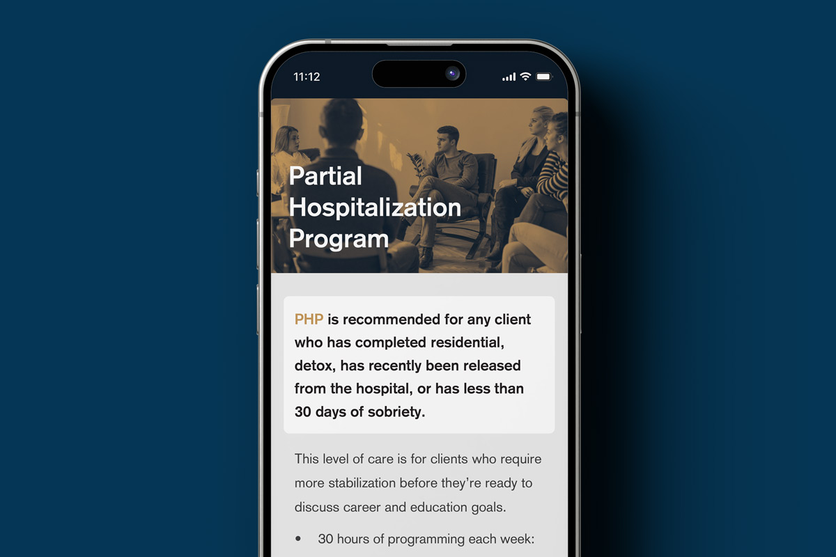
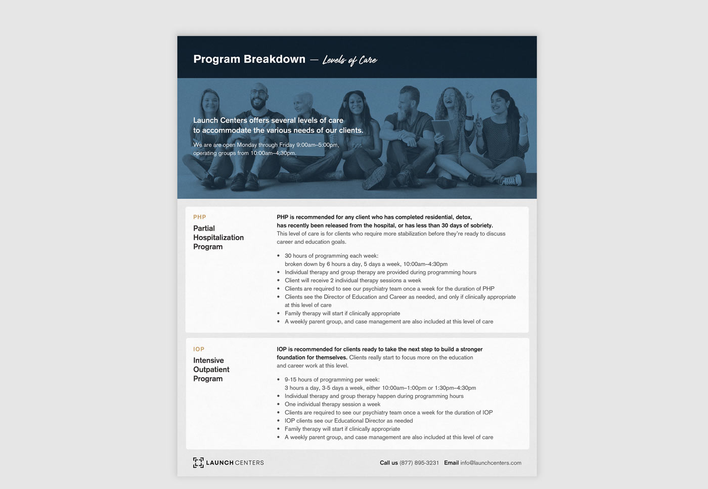
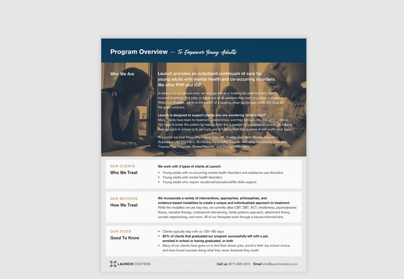
Print Collateral: Hot Off The Press
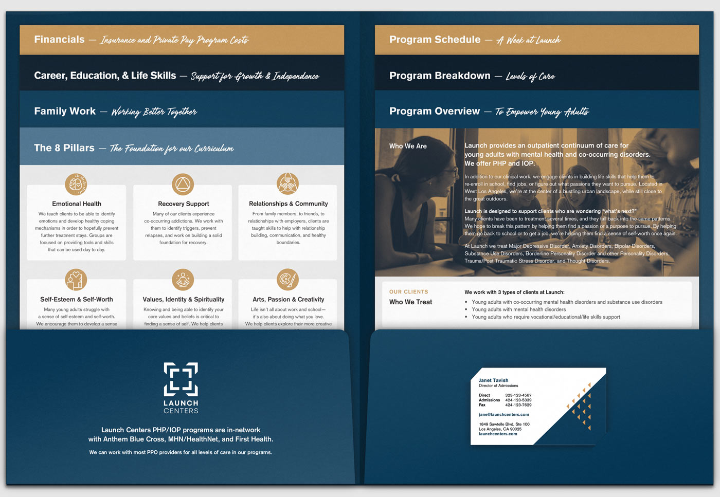
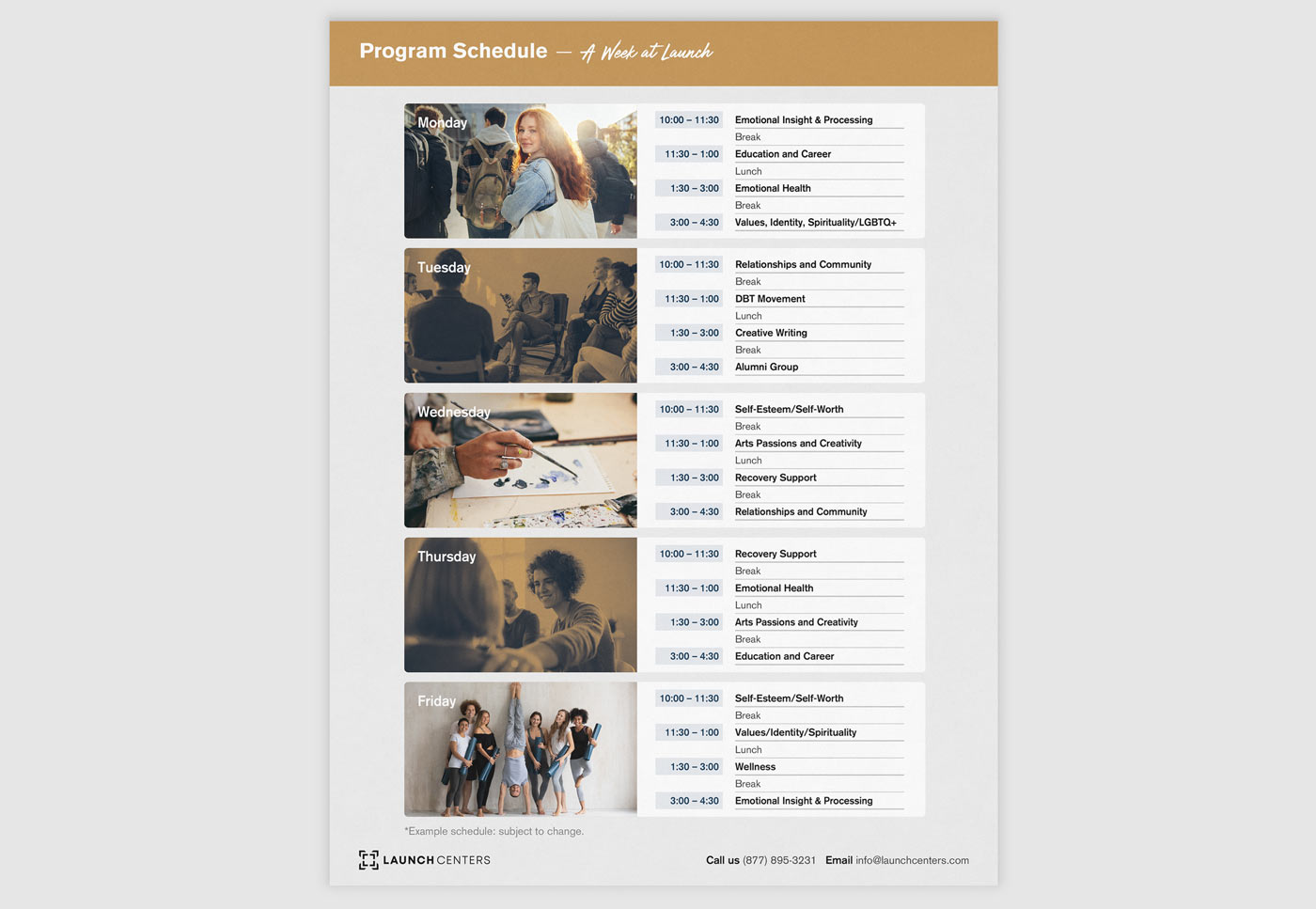
Launch needed a comprehensive info pack to present who they are and what they do.
Geared towards parents and clinicians, it had to convey trust and expertise, while also being friendly and inviting.
I created a custom folder with staggered inserts, designed to hold all their essential information.
My goal was to make it straightforward for people to find what they need without feeling overwhelmed.
Now, clients can quickly locate the information by looking at the titles at the top of each page and simply picking out the sheet they want to read.
Results & Impact: Taking Off
Launch’s branding now reflects the high calibre of their work, marking them as trusted industry leaders.
Jose and the team at Launch are proud to hand out their new marketing materials, and to welcome new clients to their offices.
Two Can Win
is a design studio based out of Montreal. Logos, brands, and websites for businesses that make the world better.
Contact
Please send an email to denise@twocanwin.xyz with a few details about your project and I’ll be in touch.
Personal Art
I make analog art using beadweaving and mixed media techniques on Instagram.
© Studio Two Can Win