Brand refresh for “Knuckles” Nilan: NHL Enforcer turned Philanthropic Force
My Role
Visual Brand Identity + Website Design + Merch Design
Special Thanks
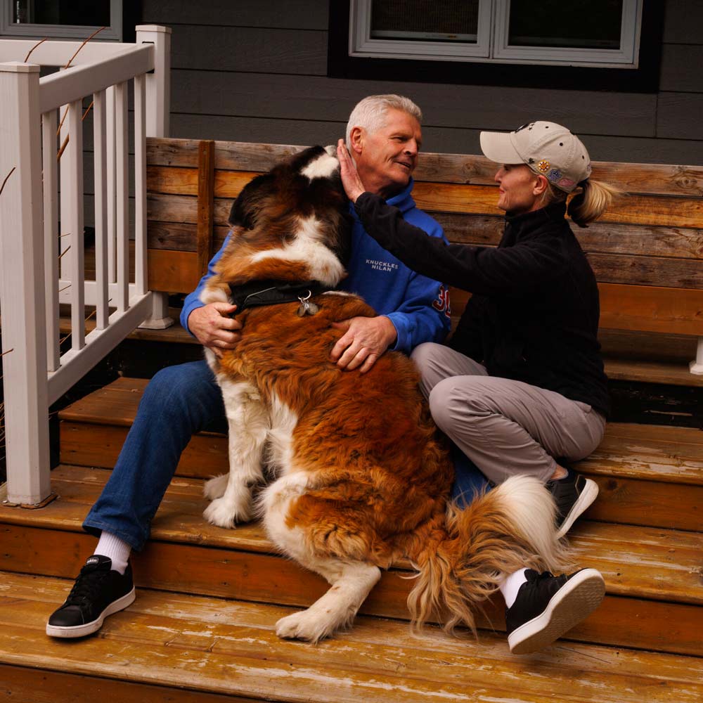
Chris Nilan and Jaime Holtz
The Context: Who’s Knuckles?
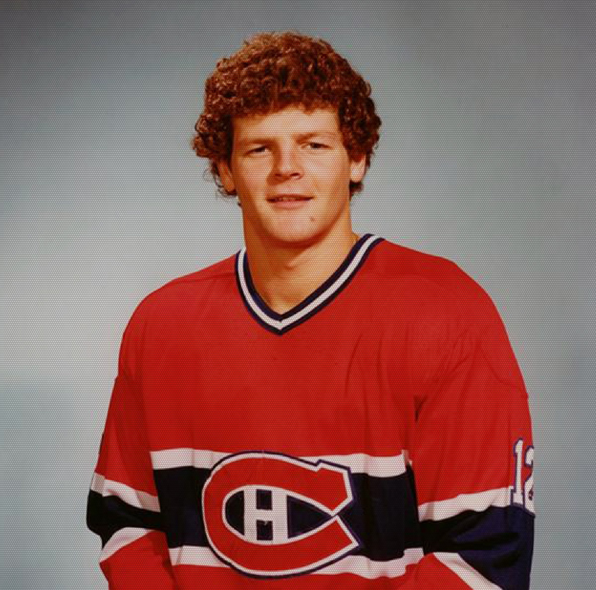
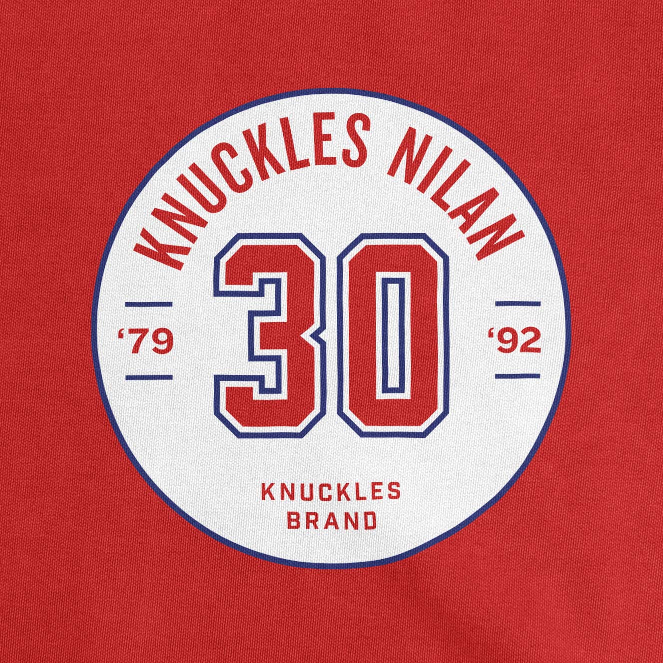
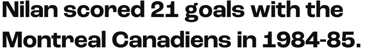
Chris “Knuckles” Nilan played ten legendary seasons for the NHL’s Montreal Canadiens between 1979 and 1992. With a career marked by unwavering loyalty, grit, and more than a few punches thrown, his name is etched into hockey legend.
However, after his time on the ice, Chris grappled with substance use disorder—a different kind of battle. But just as in hockey, he refused to be kept down.
These days, he hosts two podcasts, leads addiction recovery groups, and supports children’s charities. Talk about a comeback story!
The Mission: What Does Knuckles Need?
Chris’s website and merch, initially designed in 2013, weren’t doing justice to his vibrant story and all the incredible work he does today.
The Old Website
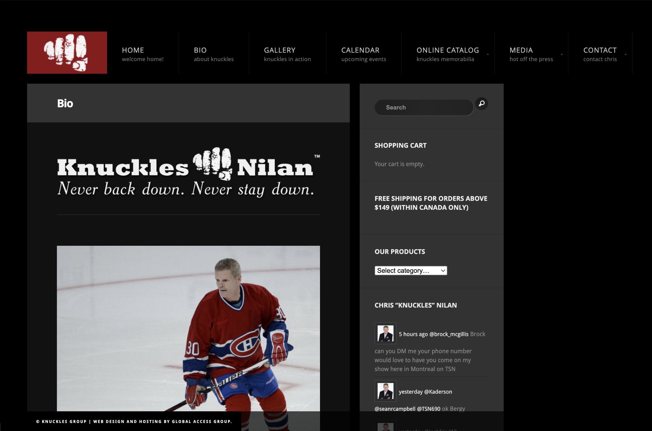
The website felt outdated and abandoned, and the limited merch designs resulted in few sales.
My goal for Chris’s brand refresh was to revitalize the “Knuckles” visual identity and website in order to effectively tell his story, highlight new projects and events, and boost merch sales.
I wanted to create a new line of merch that would connect with his fans and honor his legacy.
The Process: Here’s How We Did It
Before starting the project, I read Chris’s autobiography, and then I sat down to breakfast with him at a local Montreal diner.
This gave me a chance to catch his vibe and get to know him personally. My main takeaways? He’s a big softie with a heart of gold—but he’s still strong enough to knock your teeth out.
Chris is a no-nonsense, brutally honest, upfront kinda guy, and his fans love him for it.
It was important for me to translate that into his new visual identity and merch designs.
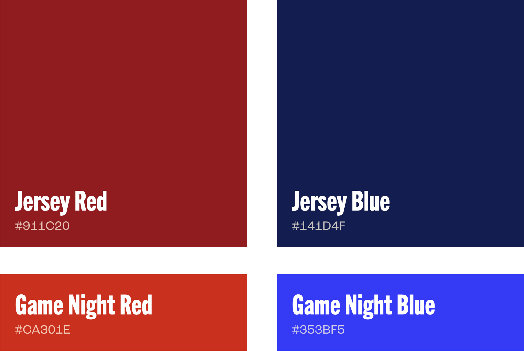
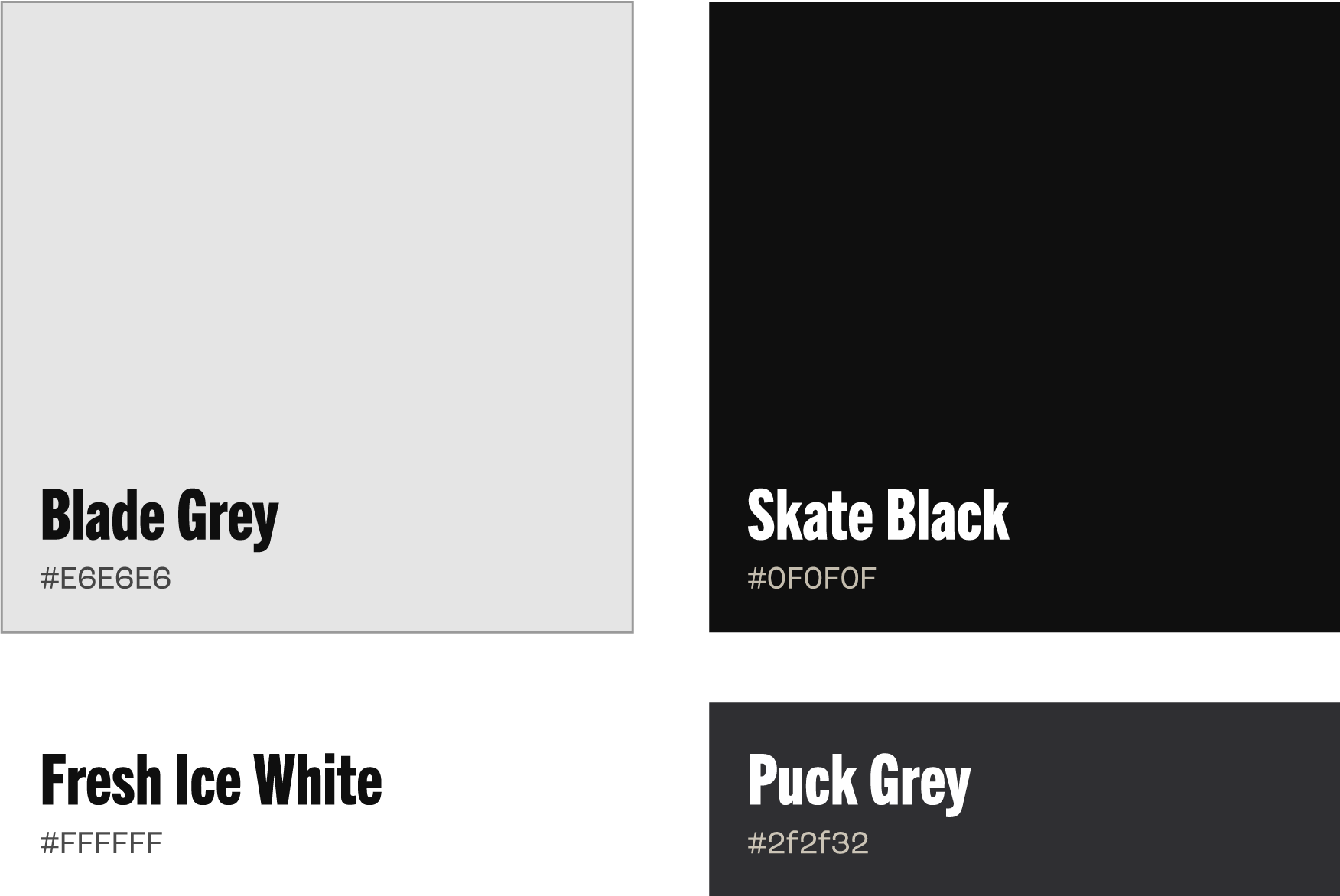
The Visual Identity: Brand Colors
As a nod to Knuckles’s career with the Montreal Canadiens, I chose a deep red and blue for the primary brand colors.
Their vivid counterparts, paired with stark black and off-white, all come together to modernize the look.
Color Palette
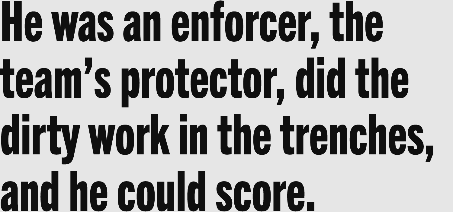
The Visual Identity: Brand Type
I bolstered the brand’s typography to capture Knuckles’s essence.
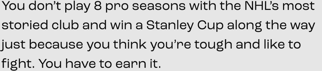
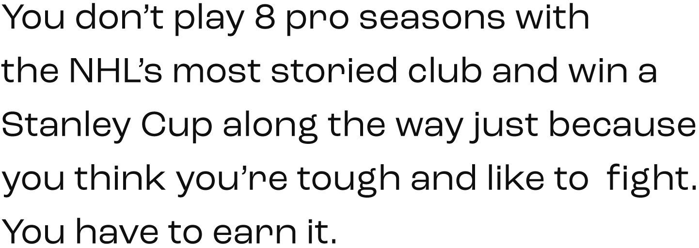
Headers are set in towering Trade Gothic. Body text is set in Roc Grotesk for a powerful and sturdy feel.

Headers & Pullquotes
Small Headlines & Titles
Body Copy


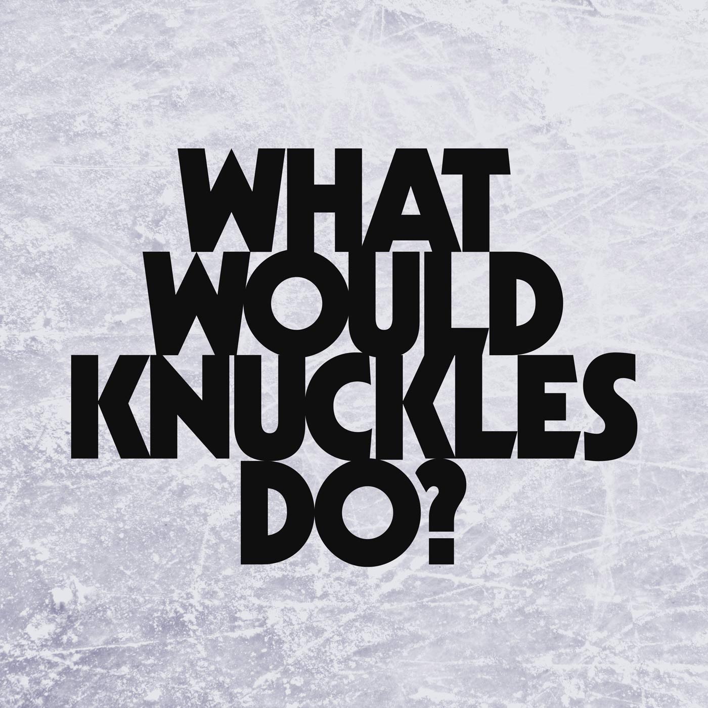
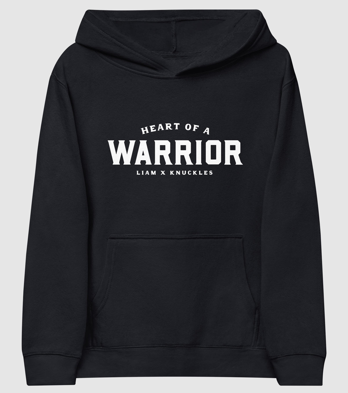
That was Chris’s motto. It guided him on the ice. Then it guided him off the ice—in his battle with substance use disorder. I chose it to play an important part in his new merch designs.
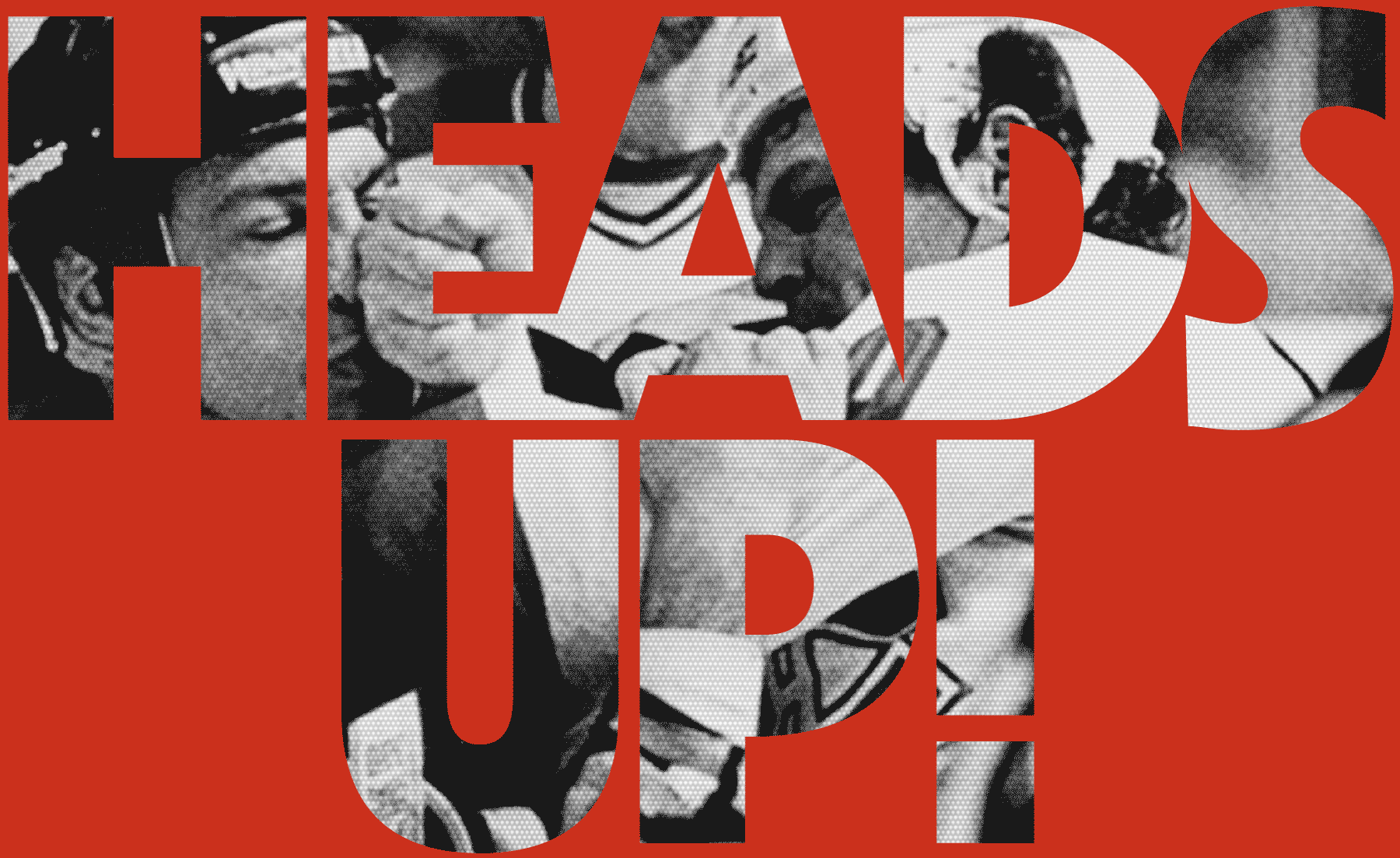
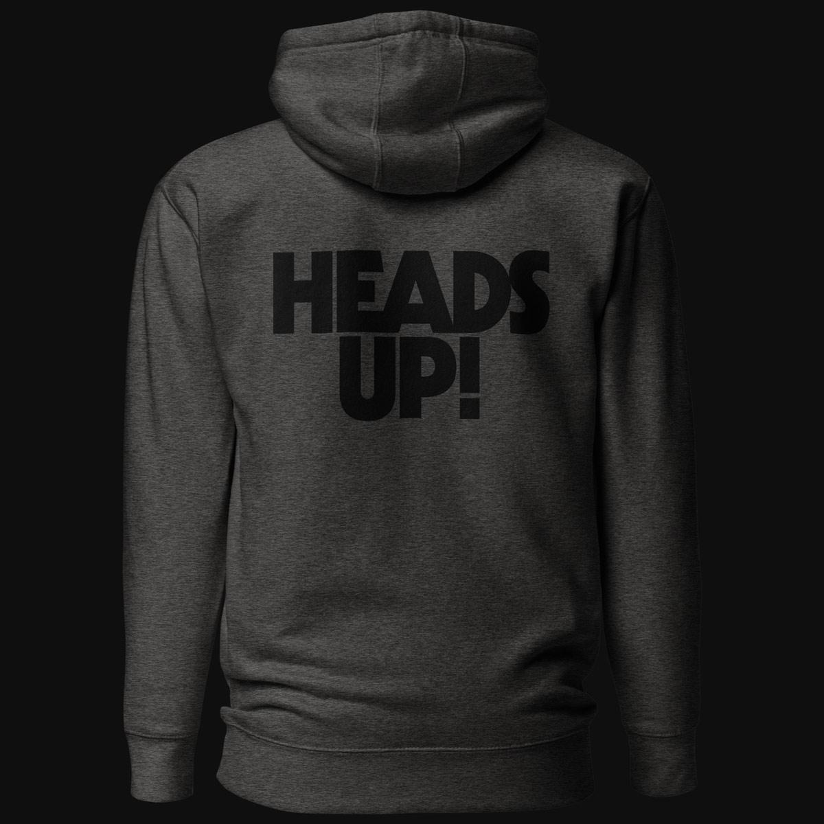
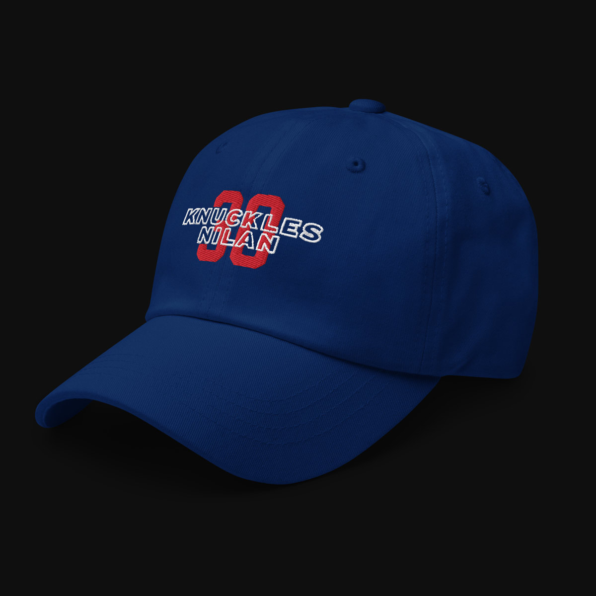
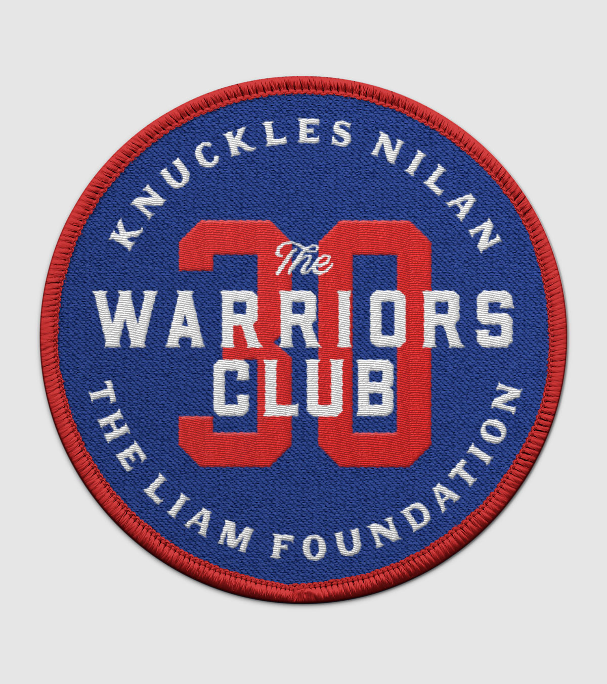
The Merch: Knuckles On Your Back
When I started sketching out designs for Knuckles’ merch, I knew it had to reflect his persona—big, bold, and in your face.
I pulled visual inspiration from hockey jerseys, sports memorabilia, emblems, industrial equipment, and vintage type from the the 80’s.
Throughout this project, I’ve incorporated vintage cues with modern design to give the brand a nostalgic yet timeless feel.
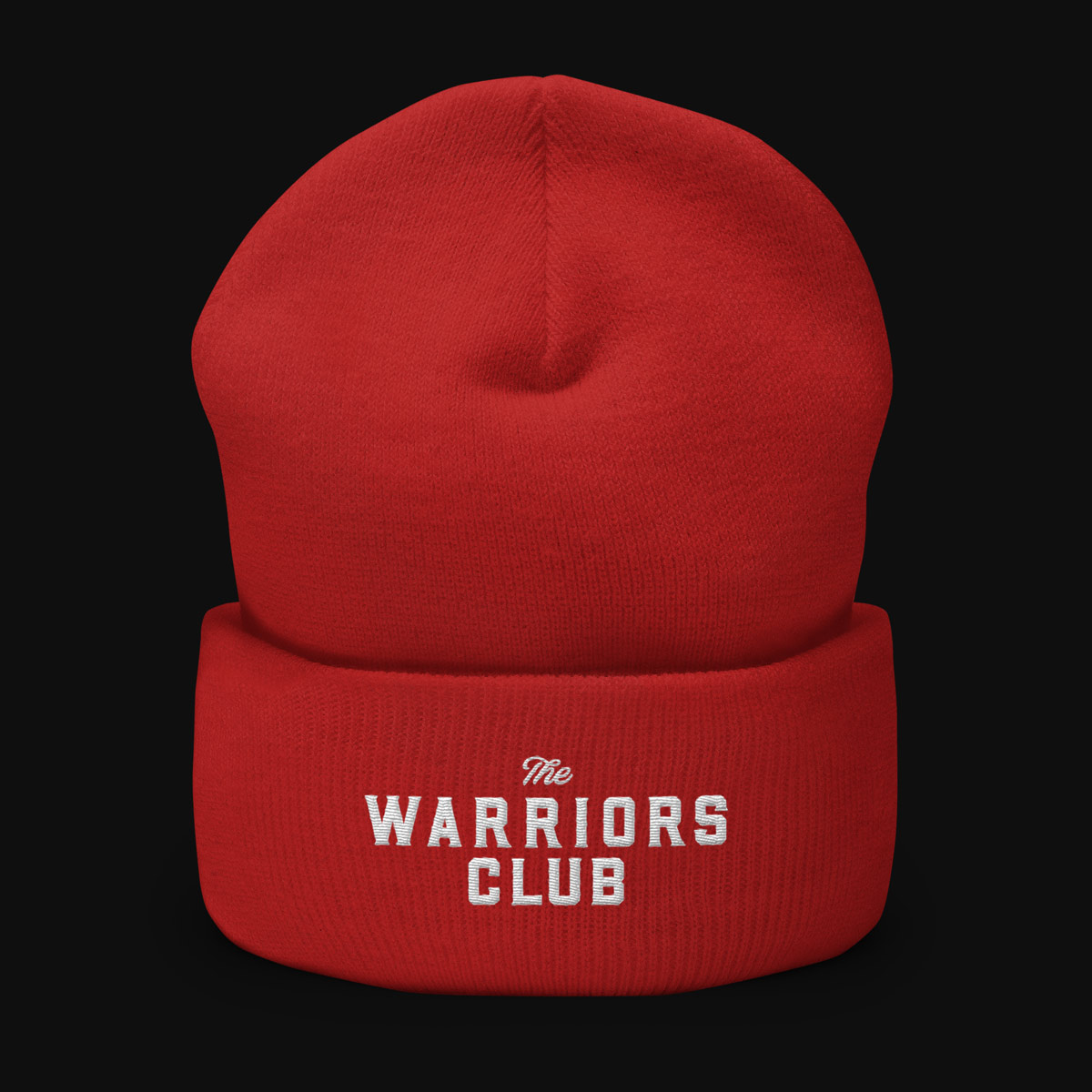
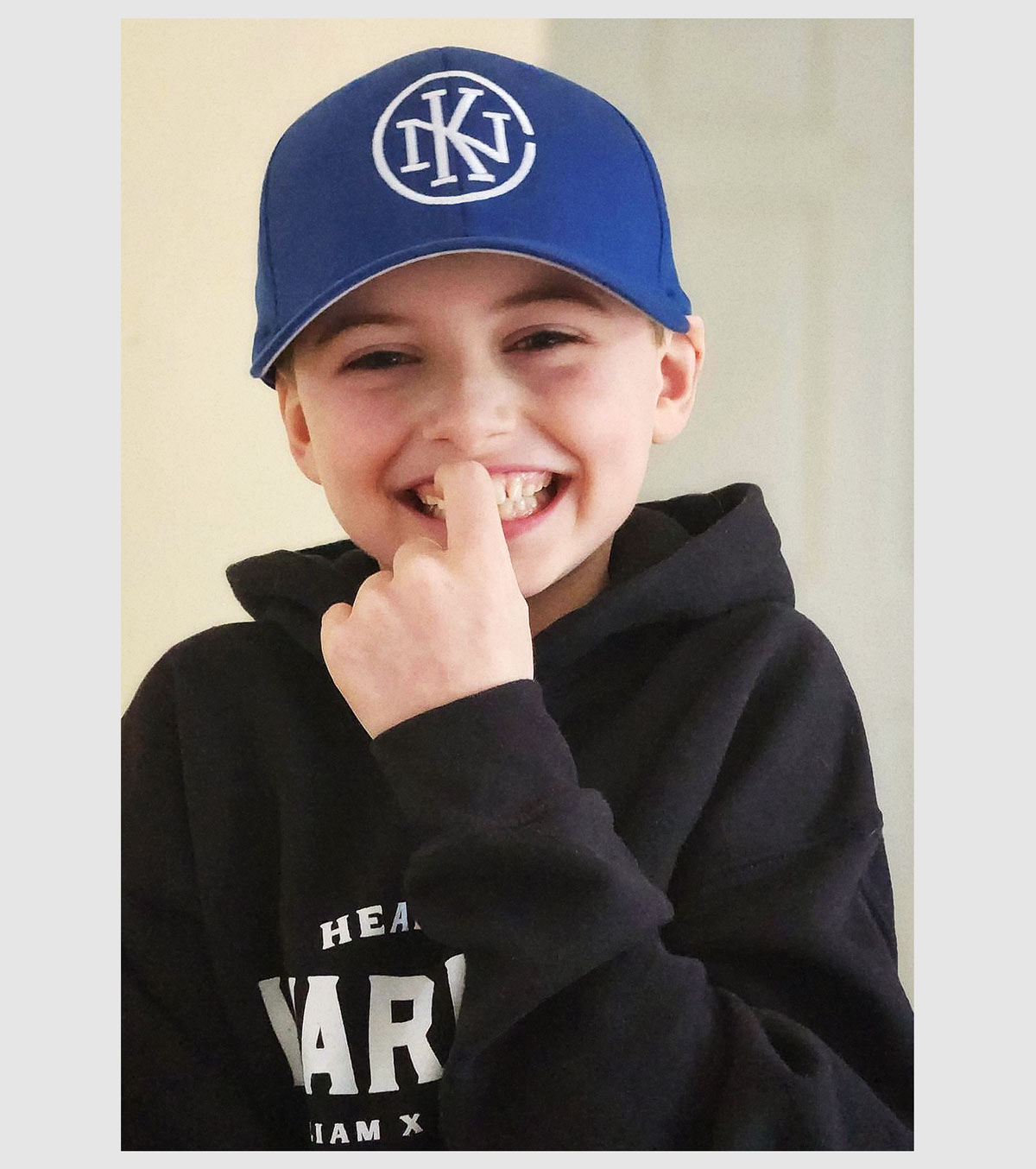
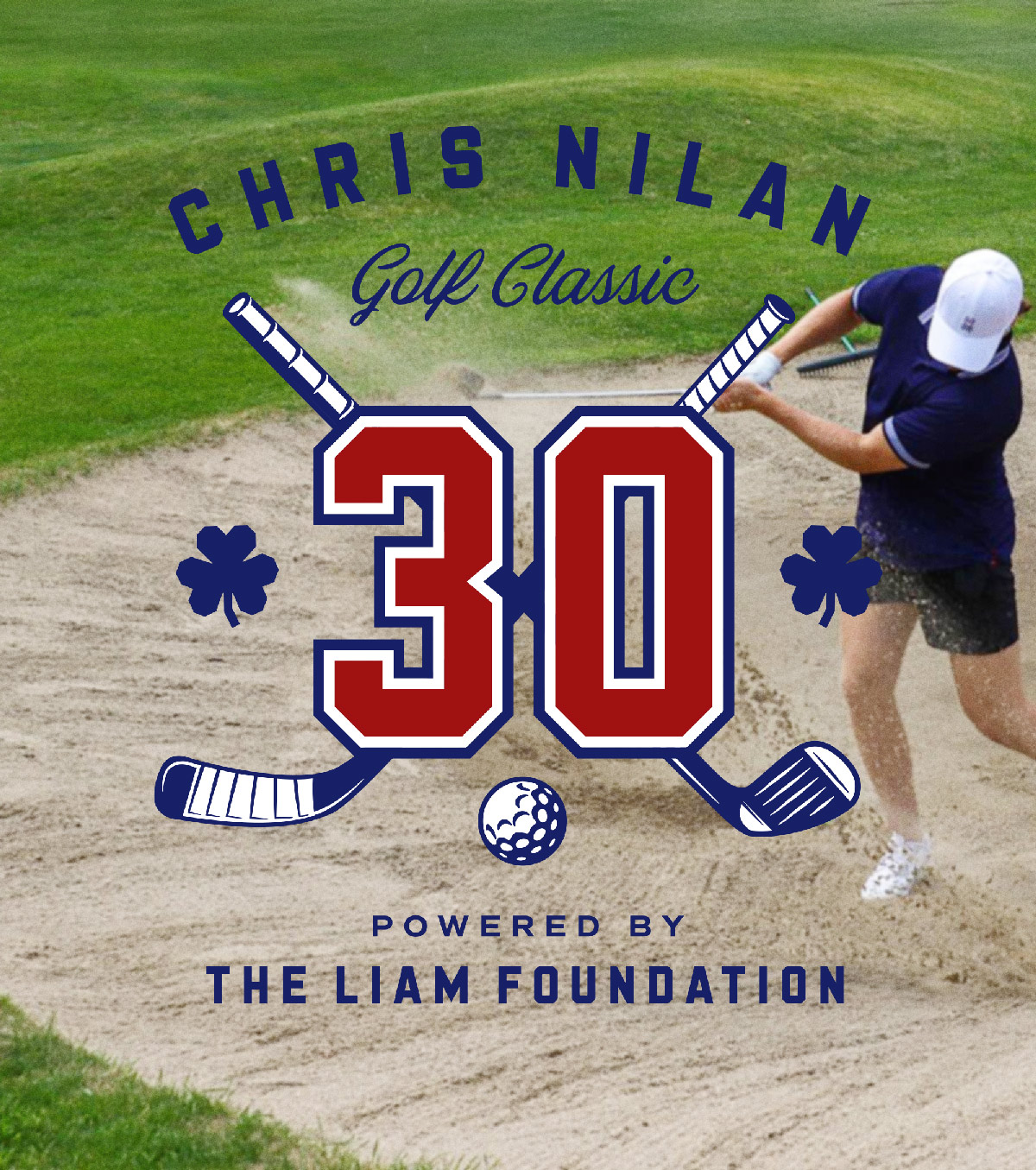
Collab Capsule: Assists Off The Ice
Chris works in partnership with The Liam Foundation, a charity raising funds to research and treat Mitochondrial disease.
I created a “Knuckles x Liam” merch capsule by distilling elements from both brands and translating them into designs that capture their shared fighting spirit.
I also designed landing pages to raise awareness and collect donations. Through live events, merch sales and direct donations, Knuckles has helped the foundation raise over $300K.
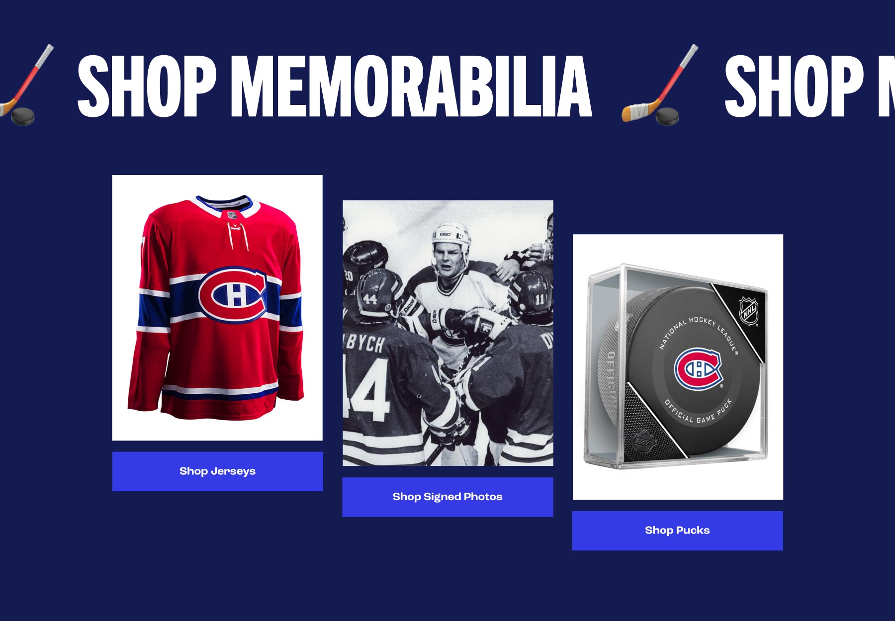
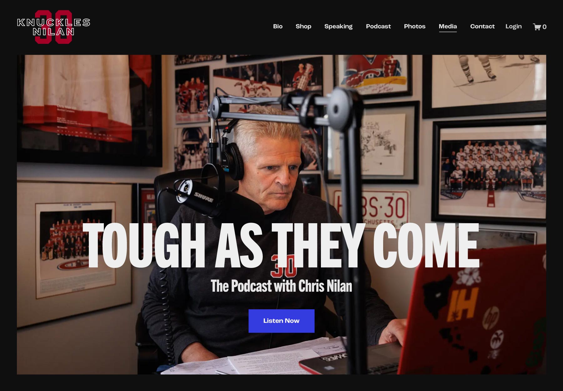
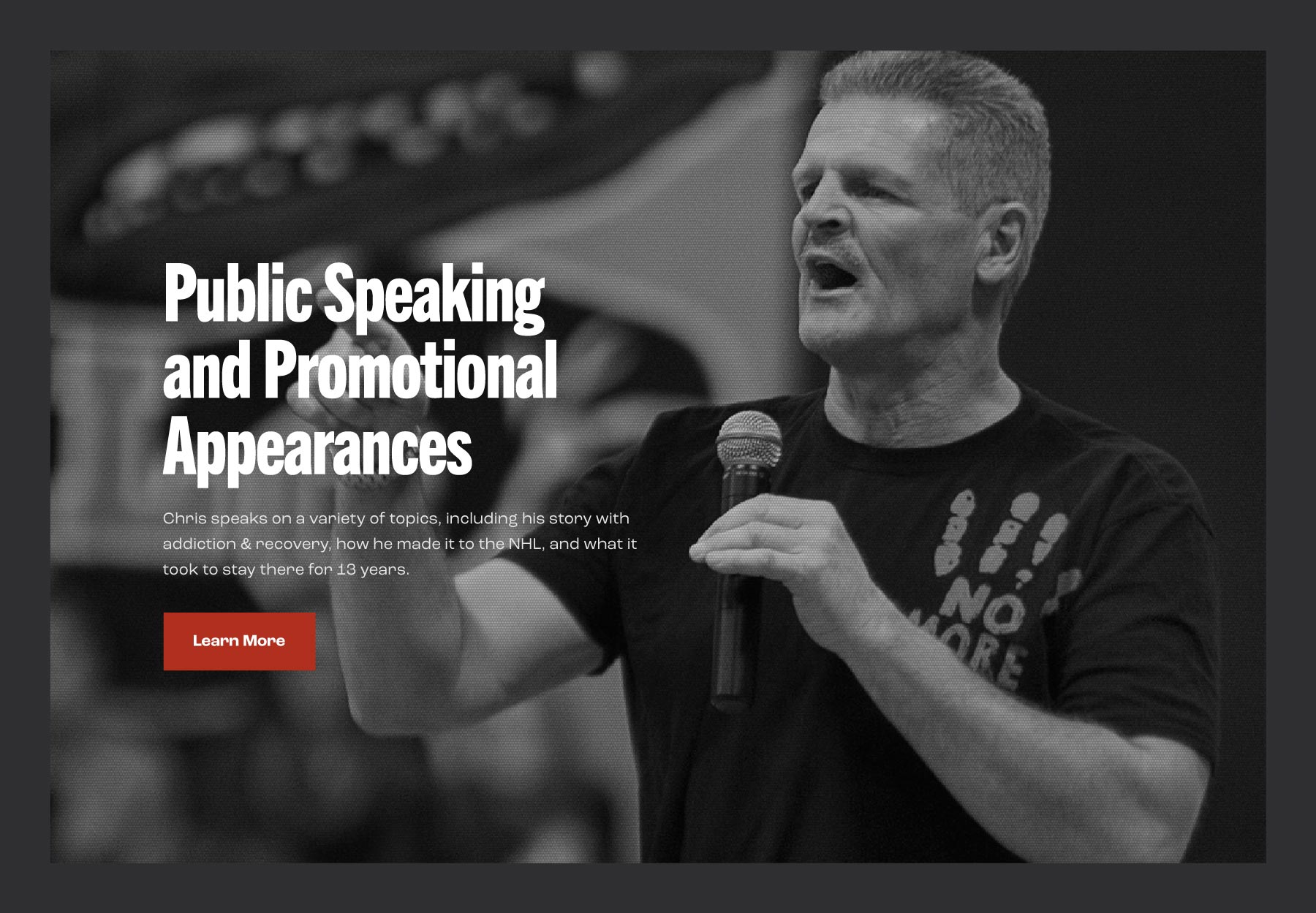
The Website: Knuckles’s Digital Arena
When redesigning Knuckles’s website, I set out to showcase his hockey legacy while also highlighting his off-ice work. With so much to share about Chris, I made sure everything was easy to find.
Fans can easily pull up photo galleries:
Shop for Merch & Memorabilia:
Check out Chris’s new projects:
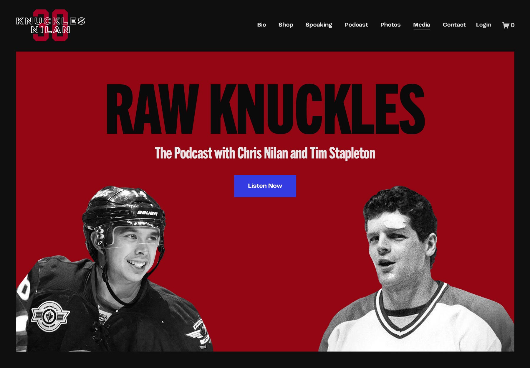
Event organizers can book a speaking event:
Results & Impact: Knuckles Brand Matches Knuckles Story
I modernized Knuckles’s brand and web presence while staying true to his roots.
His website is designed to tell his story, keep visitors up-to-date on his projects, and drive sales. The new merch I designed is flying off the shelves, with fans eagerly sharing their photos across social media.
Metrics: Knuckles Scores a Hat Trick
Over the first 12 months:
- The website has seen a surge in traffic
- The shop had an 800% increase in merch sales
- The mailing list has gone from zero to over 1,000 subscribers
And we’re not backing down anytime soon!
A Special Thanks
To Chris Nilan and Jaime Holtz, who are a pleasure to work with. They’re some of the kindest, most generous, and hardest-working people I’ve ever met.
Jaime has done incredible work in promoting the new content and merch via Chris’s social channels, which contributes so much to the success of this project.

Two Can Win
is a design studio based out of Montreal. Logos, brands, and websites for businesses that make the world better.
Contact
Please send an email to denise@twocanwin.xyz with a few details about your project and I’ll be in touch.
Personal Art
I make analog art using beadweaving and mixed media techniques on Instagram.
© Studio Two Can Win